This is a mapmaking competition entry from Joachim de Ravenbel.
Software used
CC3 / DD3 and a home-made application do design interlacing and export to CC3.
Summary
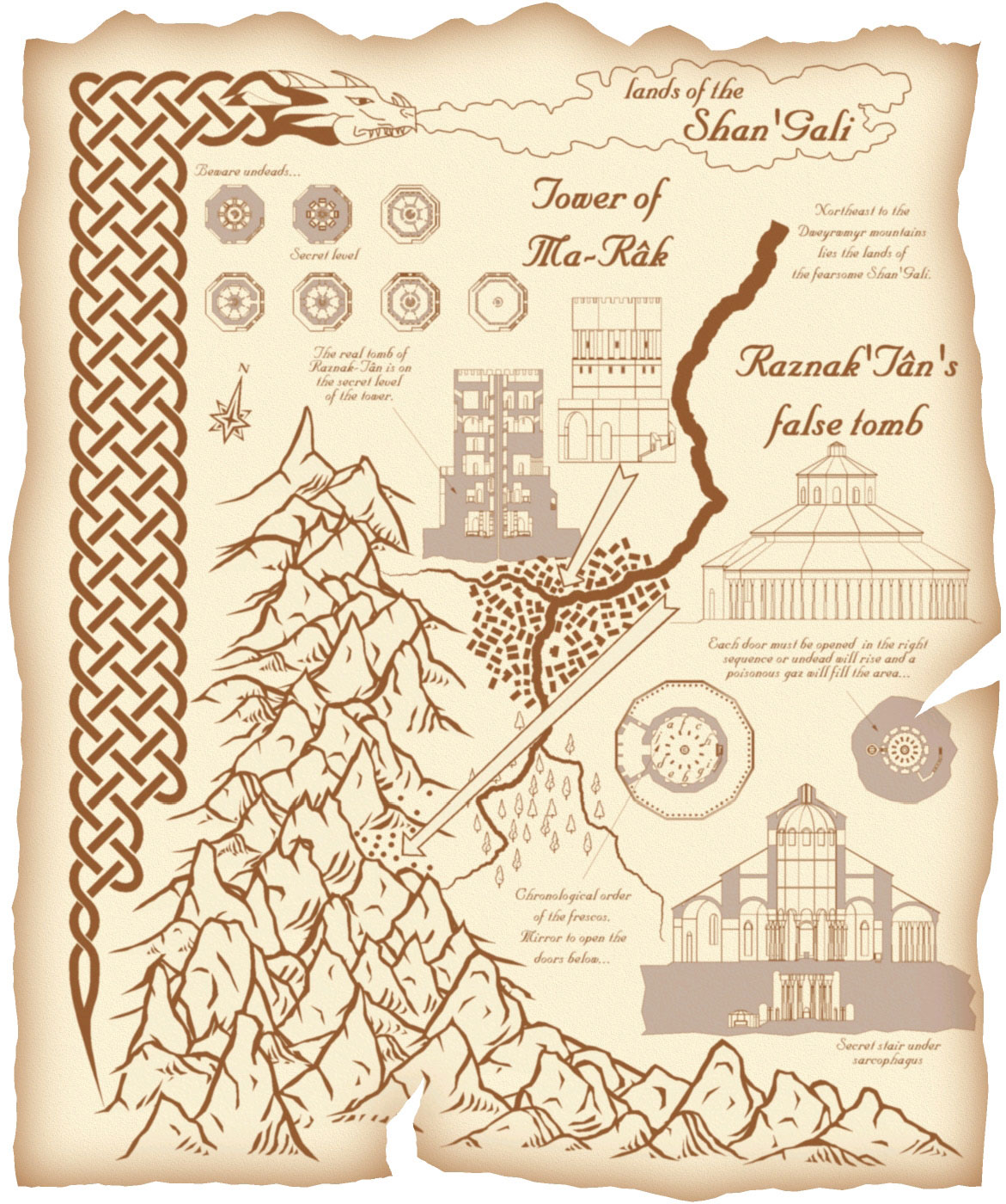
It’s a map I designed for a RPG campain with my kids.
The Shan’Gali are an ancient race now long forgotten but for the most knowledgeable scholars. They only know that the last emperor, Raznak-Tân, left a treasure that should surpass anything known today. But it is well hidden and heavily protected…
Copyright info for this map: © jdr2010.
Please follow and like us:
Wonderful map, as always, Joachim. I always enjoy seeing your work.
Very striking and original. I keep wanting to look at the cool mountains and not the buildings.
This is an intriguing piece, although the mounts have edges like shards of flint, I can accept that as stylistic.
Parchment is a good look, but it’s done a lot, so it’s important to do it well. The inner glow on the paper feels like you took a short cut. With a torn and battered parchment, I hope for a bit of wear and tear on the picture as well–clever use of layer modes (linear burn is good for parchment) and shades of sepia. Creases, grunge, all that.
Very smart piece.
A very interesting combination of lots of different styles and details in one map. I love how it tells a story in itself. As usual, your cut-away maps blow you away with their detail.
The collection of different “maps” into one, has a bit of a drawback, as it doesn’t create a unified aesthetic. The coloring does try to pull it all together, but doesn’t quite manage.
Very beautiful and original work with many many things making it interesting to look at. And the detailed buildings are very very cool! As a point of attention: it took me some time to figure out what the map was about. That’s mainly because the composition is a ‘bit messy’. Both the mountains and the river pull the eye away from the most interesting parts.
Good colour choice, the cutaways look great. An old parchment look for such an obviously old map, and this would be 10 points.
I love this map. I really enjoy the fact that you took the time to show multiple views of the different locations, that you gave their location in a wider world and that you took the time to include a wealth of decoration to add character to the map. The style is consistent and well executed.
I have two issues with the map. First is a lack of scale – both at the building level and at the larger regional level. Secondly I need the detail views to be larger. As it is they are tiny and hard to read. I can see that there’s a collection of detailed floorplans there with all sorts of fun traps and locations but I’m having a hard time reading them clearly. Nevertheless very pretty and well executed.