This is a mapmaking competition entry from Pär Lindström.
Design notes
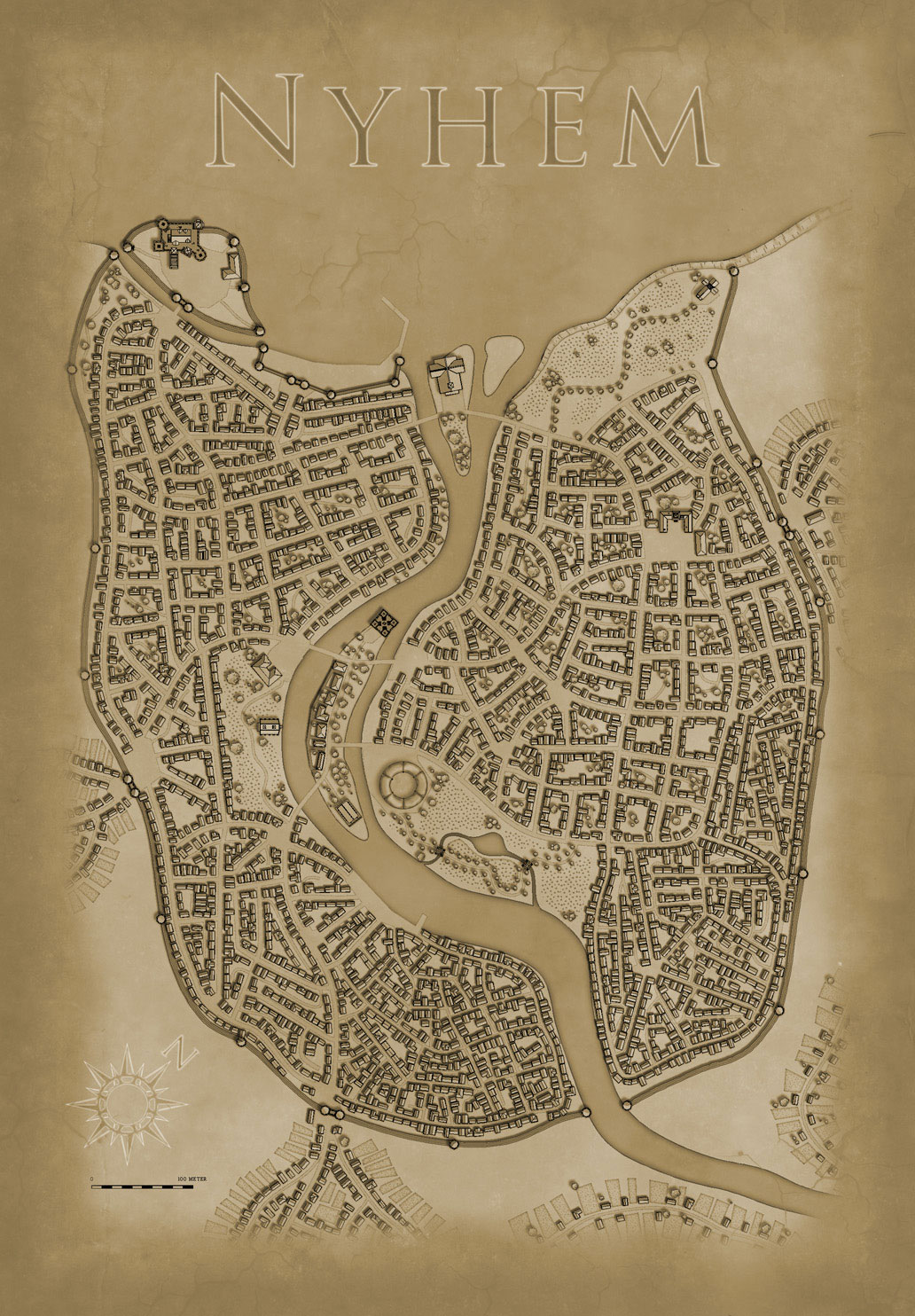
I decided to make a city map for the competition. The map is done in both CD3 and Photoshop CS5. All the houses (except the circular arena in the middle of the town) are done in CD 3. But to spice things up I decided to do some touches in Photoshop. What I did was to change the black and white map to sepia, added some hills in the upper left part of the map and put the whole thing on top of a picture of aged paper. I also added the name of the town and a compass rose.
Nyhem
The map shows the town Nyhem (in English this means New Home) a quite big town south of the capital Ankh-Bathor. The area where the town is situated is very prosperous and is mainly known for the large villas you can find outside in the countryside. Nyhem is a trading port and in the town you can meet people from all over the world. Sometimes people even call Nyhem “small Bathor” because the town is just as crowded and rich in flavour as Ankh-Bathor.
Well I can see that I translated the town wrong. Nyhem doesn’t mean New harbour it means new home.
No worries – it’s been fixed.
I think this is done very well.
I like the map, but I can’t see it well and the interface here defies my best attempts to get a larger image of the map. The symmetry is beautiful and lines flow, but the design seems a little inorganic. Other than that, it seem great. I just wish I could see it better.
Hmmm… not sure why it’s not working for you. I just right click + “open in new tab” and get the hi-res version. I’ll post the direct links to all the hi-res versions on the judges page so you can see them in all their glory.
I’d tried that before to no avail. Tried it just now and it worked. Having seen the map closer, and having given some degree of benefit of the doubt before, I’m still content with the score I gave. It’s a very “tight” map, which is a good thing, but some of the interest that I hoped would pop out at higher resolution failed to appear. Having done a number of cities myself, I know the challenges. I would have liked more personality at the micro level to offset the problem with sameness that maps like these often fall victim to.
Very, very nicely done. The beautiful monochrome colors give the map a classy look. Just a few more labels might have been perfect. My eyes are looking for names of things (e.g. the river).
That’s one big city which must have taken some time to create. The city layout is great and I love the colors. The city itself has a little ‘villagy’ look and would look more city-like if there was more variety in buildings size and shapes.
At the first glance this seems to be a great map. Large scale, very good building arrangement, many houses, old-looking colour – really fine.
Regrettably it cannot keep this promise.
First, the map lacks any labels or legend apart of the city name and the scale bar. For such an important town I would expect at least a few important points labeled. A map must explain the content to a certain degree, this is not the case here.
Second, if this is a trading port, where are the docks? The warehouses? The yards to repair ships? I can only see a whiff of a harbor. This contradicts the description heavily.
Despite this all, Mr Lindström’s map is probably the one which has the greatest potential to become an eyecatcher if the lacking details are added.
This map certainly draws you in with the detail. I like the street layout – it makes sense. Some blocks are wider others are more jumbled. However I’d also like to see some variation in the buildings. The slums of the region should be small buildings rammed side to side, the noble and merchant quarters should be a much smaller district with larger houses and then a few mansions. As it is, most of the map looks very similar.
The variations that are in there are great – I like the castle, and the gardens to the NE. The small farming houses to the south are also prety interesting – though I wonder why the farms are so small. I also don’t mind the lack of labels – I’d be happy to take this and use it as the base for my own city. But for a map of an existing city I’d need more detail – even just labels on the different districts would help.
As for the style I have to disagree with some of the other posters. This is clearly not hand drawn so I don’t like the fit with the parchment background. The fade out at the edge is obviously a computerised fade rather than pen lines trailing off, so it jars with the background. If this were coloured up as a satellite plan with crisp edges I’d prefer it to the parchment texture.
All that aide – this is still a convincing city layout and a very useful map. Good work!
Thanks for all the nice words and for some insightful critique. This map started out as a practice map and with the critique I got back from all of you it really filled its purpose. It was also great to be in this competition.