This is a mapmaking competition entry from Warren Godone-Maresca.
Software Used
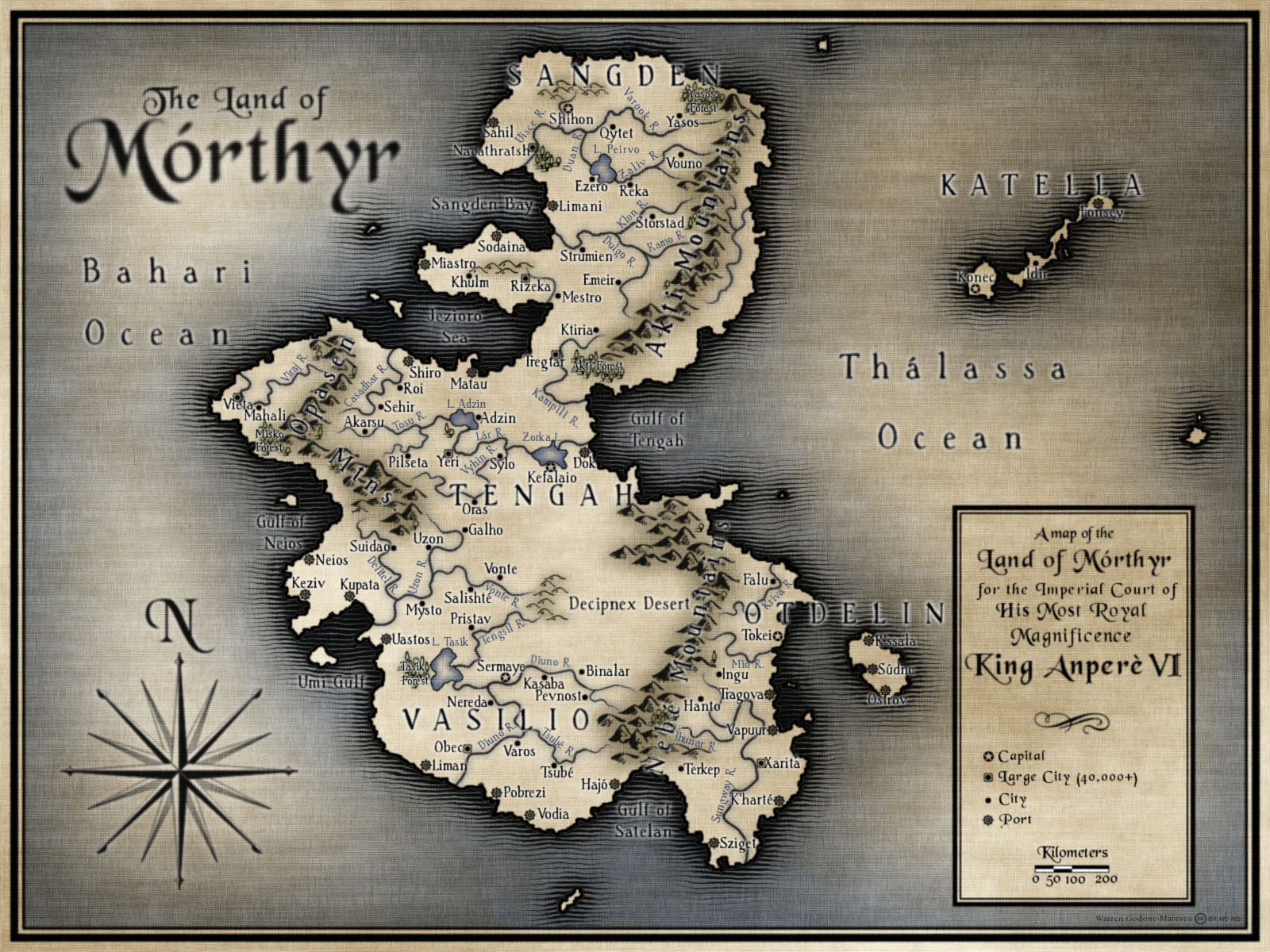
The map was made in GIMP. The mountain brushes are from http://pickebu.deviantart.com/, the hill and tree brushes are from Cartographers’ Guild, and the compass is from http://www.clker.com/.
Map Design
The land mass came from some rendered clouds to which I applied a threshold. Then I slightly edited the shape. I myself made the texture in GIMP. The map was made more in tune with the texture by using the Gaussian Blur filter many times using varying amounts of blur each time.
The name “Mórthyr” comes form the Irish word “morthir”, which means “mainland”. There is not really any history behind the map because I made it specifically for this contest.
Copyright info for this map: BY-NC-ND Creative Commons.
This map is great. I like the choice of a cloth texture and the contrast. The choice of black instead of the more common sepia gives this a very unique “inked” quality. The shape and shoreline are very realistic. The compass looks great, too.
It’s China, with a bigger Manchuria and no Tibet.
Beautiful work. I agree with the above comment, the inked look really makes this map pop. What a wonderful technique.
The blurs are messin with my eyes and the small text and gray text is hard to read but the overall image is interesting.
This is a sharp piece with a very strong appeal. Two things I find disconcerting. One is the yellow tinge in certain parts of the map. I’m colorblind, so it could be my imagination, but it hits me the same as those b/w commercials with little bits of color. It’s jarring to me. Might just be me though.
The other thing is the woodcuts. I love woodcuts, but I expect them to react to the features of the map, so they should cluster around shorelines, which yours do, and they should also cluster around features in the water, which yours don’t. The result is that it look like you did some good woodcuts, then plopped the rose, legend and labels on top of it.
Nevertheless, one of the best pieces here.
That’s a beautiful map! I dig the way you’ve done the sea texture around the coast. The text could stand out a little more clearly in some places.
This is a very striking piece. Both textures and font-pick are great giving it a nice authentic look. I also love the waves (they look great), but in my opinion they are a little too heavy/dark.
Very good old-style map, with a little bit too strong blur at the text.
This is a really good example of a antique map with woodcut seas. I like the consistency in the symbols used. They all contribute to an overall style that ties the piece together. I like the background texture – though it’s a bit dominant in places. I have to agree with others about the blur used on some elements. Maps should be clear. There’s no need to blur elements like the compass. It just make my eyes think they’re nor focused. Also, the small text on the forests is very hard to read. I’d suggest clearing more space around the letters – perhaps out to a 2-3 pixel distance from each letter – to give them space to be read.
Nice and clear, and attractively laid out – good job!
Love the style of the map. Would you be interested in working on a map for a fantasy novel? Let me know if you’re interested and I’ll give you more details. Regardeless, great work!
I’m writing a fantasy novel right now, and I was wondering If I could use your map? I’d give you full credit for the map!
Hi Jackson,
Since this map was from a guest artist, it doesn’t fall under my normal “anything goes” license. He has it licensed for non-commercial use under these terms – http://creativecommons.org/licenses/by-nc-nd/3.0/. If you’re looking for any other permissions, then you’ll need to contact the artist directly to work something out.
what was the font used for the title of the map?